Endless renos to keep up with the Jones’ are not my thing, but if your decor is looking a bit tired, targeting a couple of problem areas can create a whole new vibe.
Bad decor trends from yesteryear
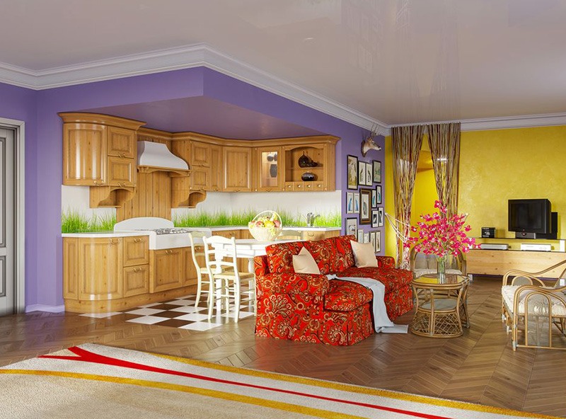
- Feature walls. This is bad decor trends from yesteryear # 1. These were a go-to in the early 2000s and an achievable DIY that went a bit too far. Bright red behind the TV, yellow to set off the bedhead and how about a pop of purple in the kitchen. The fix: Modernise by painting over it in a darker colour or to match the other walls. If you are like me this may scope-creep out to the rest of the room and house, so be restrained if resources are limited.
- Spongepainted walls. This textured horror was dated before it dried. Many pots of of deep purple, red and green paint died in the process. The fix: A lot of sandpaper and a fresh lick of paint, applied uniformly with a roller or brush.
- Chalkboard walls. One word: chalk dust. The fix: Again, sandpaper and paint.
- Floral bedding with frills. I know cluttercore is a thing, but old bedding just smells bad. And that flounce which goes under the mattress to create a skirt for the bed – just no. The fix: Some animal shelters and vets will take bedding and if not, donate elsewhere.
- Floral furniture. As with floral bedding, this is Retirement Chic that belongs in aged care or on the Golden Girls. The Fix: Send it back to the 80s on a time machine, or hope you can donate it.
- Word art decor. Aspirational quotes live in your journal, not on your walls. And just as an aside, definitely not as a tattoo. Live, Laugh, Love is a nice mantra but displaying it doesn’t make it any more helpful. If anything, these affirmations-as-decoration lose their potency as they gather dust and wrinkles. Wooden block lettering placed on shelves are in the same category – unnecessary. The fix: Remove and hope to donate to someone still aesthetically living in 2008.
- Wall stencils. Related to the previous point but rather than words, think birds, tree branches, butterflies. The fix: Remove it – it’s wall clutter. Hopefully it will peel off.
- Vertical blinds. Bad decor trends from yesteryear number 8 is my favourite, and the worst. I grew up with these and they still rear their ugly heads, reminding me of shoulder pads and teased hair. Venetian (horizontal) blinds possibly still have a place in our homes but their vertical cousins definitely don’t. The fix: Not cheap or easy sorry, but save your pennies for more current window coverings.
- Pine wood kitchens. En masse in a kitchen a lot of wood can be a bit overwhelming. The fix: Thankfully the wood can be painted and freshened up to create a more neutral, less menacing look. Look up shaker style kitchen cabinetry, which is more subtle and modern.
- Border wallpaper. Looks pretty dated, definitely one of the most obvious bad decor trends from yesteryear. The fix: Remove and re-paint if need be, or use a uniform wallpaper choice. Your wall should not look like corner-doodles on a notebook.
- Tile accent strips in bathrooms. You’ll know it if you see it, all the rage in about 2005. What were we thinking? The fix: Anything you do will possible lead to a complete re-tile, which leads to a bathroom reno. My condolences.
- Millenial pink anything. The name says it all really. Rose gold as its fancy cousin is a bit passé as well. The fix: Replace, donate, paint over.
- Futons. Even traditional Japan keeps theirs locked away in the cupboard when not being slept on. The fix: If you can fit one under the bed for guests, great – otherwise try a donation stream.
- Nautical themes. Unless you literally live on a boat, it doesn’t matter if your house is near a beach, sea shells don’t look good in the fruit bowl. The fix: Return shells back to the ocean and take anything else to the op shop.
- Wrought iron. It’s up there with Tuscan kitchens that did the rounds in the early noughties. This metal-and-dark-wood theme from the same era looks gloomy and dated now. If you were lucky, there was a wrought-iron CD tower and some stained glass touches as well. The bar in Cheers sums it up. The fix: Time to go.
- Glass blocks as walls. Often used to create light and privacy at the same time. They remind me of my dentist’s office, and Miami Vice. The fix: Not cheap or easy, so maybe suck it up and embrace your inner 80s child.
- Trinket cabinet. It’s a cluttery piece of furniture designed to store … more clutter. Nobody needs to see your teacups and vases – pop them away like the rest of us. The fix: You can probably get some money by selling online, as people have all kinds of crafty uses for these.
What are your thoughts? Do you have any of these bad decor trends from yesteryear lurking at home?

